
If you’re looking to create seamless shopping experiences, don’t forget your mobile users!
With its robust features and user-friendly interface, Shopify provides businesses of all sizes with a cost-effective and enterprise-ready platform to sell products directly to customers. One crucial aspect of any successful e-commerce website is the checkout interface, where customers complete their purchases.
However, when it comes to mobile users, there are certain challenges that need to be addressed for a seamless shopping experience. Let’s take a look at this with Allbirds’ Shopify storefront.
A tale of two checkouts
Many businesses that sell their products or services on Shopify websites offer one-time discounts or promotions to entice customers, which usually require a promotion code to be entered on the website before it is applied to the order. In most cases, this code is entered during the checkout process. However, a significant issue arises when users access the checkout interface on a mobile screen:
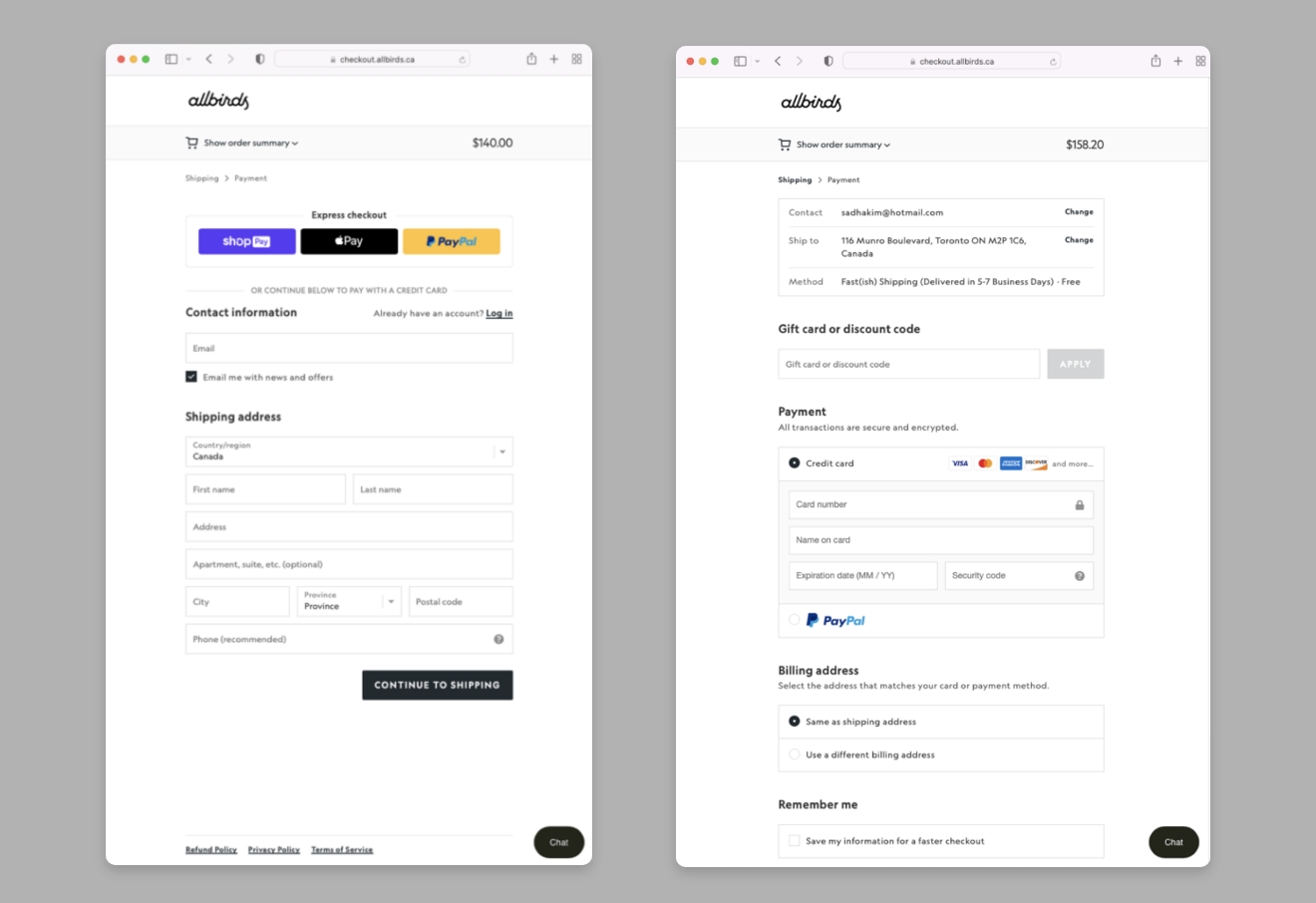
Image source: www.allbirds.ca
On a mobile device, the initial checkout window typically presents users with a choice: they can either opt for “Express Checkout” or enter their shipping and payment information manually. However, this initial window lacks an option to enter a promotion code. The option to enter a promotion code only appears on the final screen when users reach the payment step.
If customers choose the express checkout option, they lose the opportunity to apply the discount. This forces customers into an undesirable trade-off between the fastest and most frictionless checkout option (e.g., Apple Pay, Google Pay, or PayPal) and the ability to use a promotion code.
Don’t neglect your mobile users!
Mobile browsers dominate web traffic, accounting for around 60% of total web traffic, and this trend has been steadily increasing for years. When designing and creating a user interface, it is crucial to prioritize mobile users by thoroughly testing, managing, and considering the mobile experience.
Mobile users crave a shopping experience that is intuitive, responsive, clear, and frictionless. Delivering on these expectations to convert one-time shoppers into loyal customers requires a thoughtful and customer-centric approach to web design.
Want to learn more about how to create seamless e-commerce experiences on any device? Get in touch with us today to learn more.